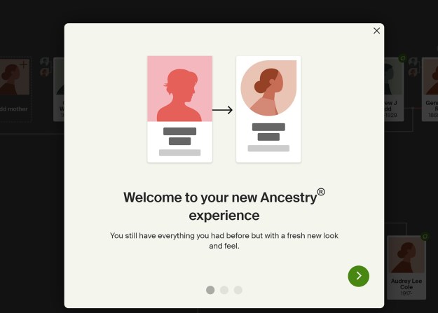
Not feeling like doing any more actual work today, I just opened Ancestry for the first time in a couple of days and got this.
I did not ask for it. I do not want it. My tree looked fine before. It worked fine before.
Except for the fact that a lot of search capabilities I’d like to have are missing. I’d like to be able to find things like:
- How many lines I have going back at least, say, 10 generations? Or pick a number.
- The earliest ancestor identified on a given line.
- Where, proportionally, my known ancestors actually lived, say, four centuries ago.
- How many people I have on the tree — across the tree, not just in one line or the other — who lived in, say, the 17th century.
Why? Because I’m curious just how much of my tree is missing. If you go back 10 or 11 or 12 generations, what percentage of the full tree is actually identified? I’m guessing it would be less than 1 percent. The people identified tend to be the ones who were wealthier, more prominent, especially the ones who have their own Wikipedia pages.
This can give you the wrong impression about your tree — that it’s full of big shots. And I don’t want that.
And I’m just curious to know how many people in history have just…disappeared.
But I can’t do things like that, which you would think I would be able to do with a decently-constructed database.
I mean, maybe I can, but I haven’t been able to find that out. If you embarrass me by showing me how to do it, I’ll be grateful.
Anyway, until you give me some stuff like that, hold off on the pointless cosmetic remakes. Especially when they don’t even look better…


I don’t like the new Ancestry.com look either.
I think I ranted on this before also: Paid a fee for Fold3 so my wife could look up details of her uncle who died in Italy during WWII. Well, there’s another layer of Fold3 to get many records that requires an ADDITIONAL fee. Rip off.
I signed up for Newspaper.com for a fee to find obits etc from archives. Well, many newspapers (The State, Charlotte Observer etc) aren’t under that fee. There’s an ADDITIONAL fee for those many other newspaper archives. Rip Off.
Ancestry.com is owned by the world’s largest hedge fund, squeezing out every dime they can. Rip off.
Family Search redesigned their site also. To me, it’s much more difficult to navigate. Why is newer always
sold as better?
The major differences seem to be a change of font, and redesigning the little boxes or tiles or whatever that represent each person on the tree so that they look like Polaroids.
Don’t ask me why.
Thing is, they spent time and money doing this, instead of doing something useful.
There’s a bigger point here.
Increasingly in our internet age, a larger and larger portion of our economy consists of people being employed by tech companies to constantly, constantly, pointlessly change the product.
And Ancestry is far, very far, from being the worst culprit. That would be Facebook. I’ve never been a big fan of FB, although it has its uses. So I mostly stay away from it. Which means when I go back to it and need to DO something, I have to figure out how to do that, because the procedure has changed, and the various buttons and menu items are in completely different places.
I don’t want all these people to be unemployed. I just wish they’d spend their time making the product BETTER, instead of just different. And I’m happy to wait. If it takes them five or 10 years, fine. Just get back to me when you’ve got something good, and in the meantime stop messing with me…
When I say they’re being employed to change the product “pointlessly,” I am of course speaking from the perspective of a user, a customer.
I suppose there’s always some point to it in terms of squeezing some more blood out of the money stone, but it doesn’t benefit me. It just hassles me…